10%
When a new company plans to hit an already-dense market, it has to arrive to the arena equipped with materials that will outline its mission, vision, and overall corporate identity. We help Bauriss build a brand from the ground up, designing visuals that attract their target audience and invites them to become a part of this amazing startup story.
April 2017,
STARTUP / Web Application for Storytelling
Stockholm, Sweden
The startup started its journey in our studio, on a plain whiteboard. At that point, it was nothing more than a few lines of our client's thoughts and our recommendations. From the earliest stages, we knew that we are in for an amazing adventure that will turn in a never-ending story.
We had the opportunity to guide this startup from the beginning - from creating the logotype to developing a complex web application, and we invite you to take a few moments of your day to find out a bit more about the project. We expect one of your intriguing stories to become a part of this social community that shows great future potential.
February 2017
Branding, Visual Identity, Business Development
Klagenfurt, Austria
The story behind this startup is based on a charitable idea to help everyone who needs home care. Considering the humanitarian character, it is no wonder Harmony & Care quickly received the much-needed funding that only further proved this startup's worth.
We are happy to be included in the development and realization of this project intended for those who are in dire need of a helping hand during the last chapter of their life. And we are proud to be a part of it.
January 2018
STARTUP / Mobile and Web application
Novi Sad, Serbia
It was quite a challenge for us to help the two ambitious fellas from our home town take their project from the initial idea to a fully-functional mobile app. They wanted an iOS and Android app that users will be able to use with ease to report any issues in their environment. We were so impressed with the idea that we strived to design a visual identity that will impress the investors and take this project to the next stage. We are ready to do whatever it is in our power to help this app to become a go-to solution for any problem that requires fixing.
See on Behance
May 2015
STARTUP / Digital omnichannel for ordering food in a restaurant
Zurich, Switzerland
The collaboration lasted for almost 5 years and during that time we assisted our partners to transform from an ambitious startup into the established business that now sets the bar high for the restaurant industry. It was our pleasure to form a corporate identity, illustrate every feature, and help grow this business from a 5-people office to the establishment with more than 100 employees. Excellent internal communication and external marketing efforts lead us to this day when we see this ship sail towards the leading position in the HORECA industry.
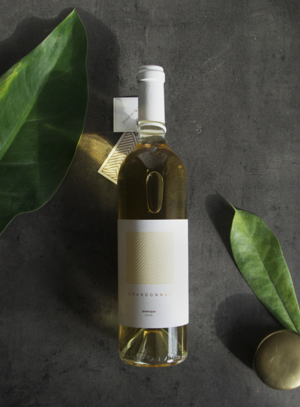
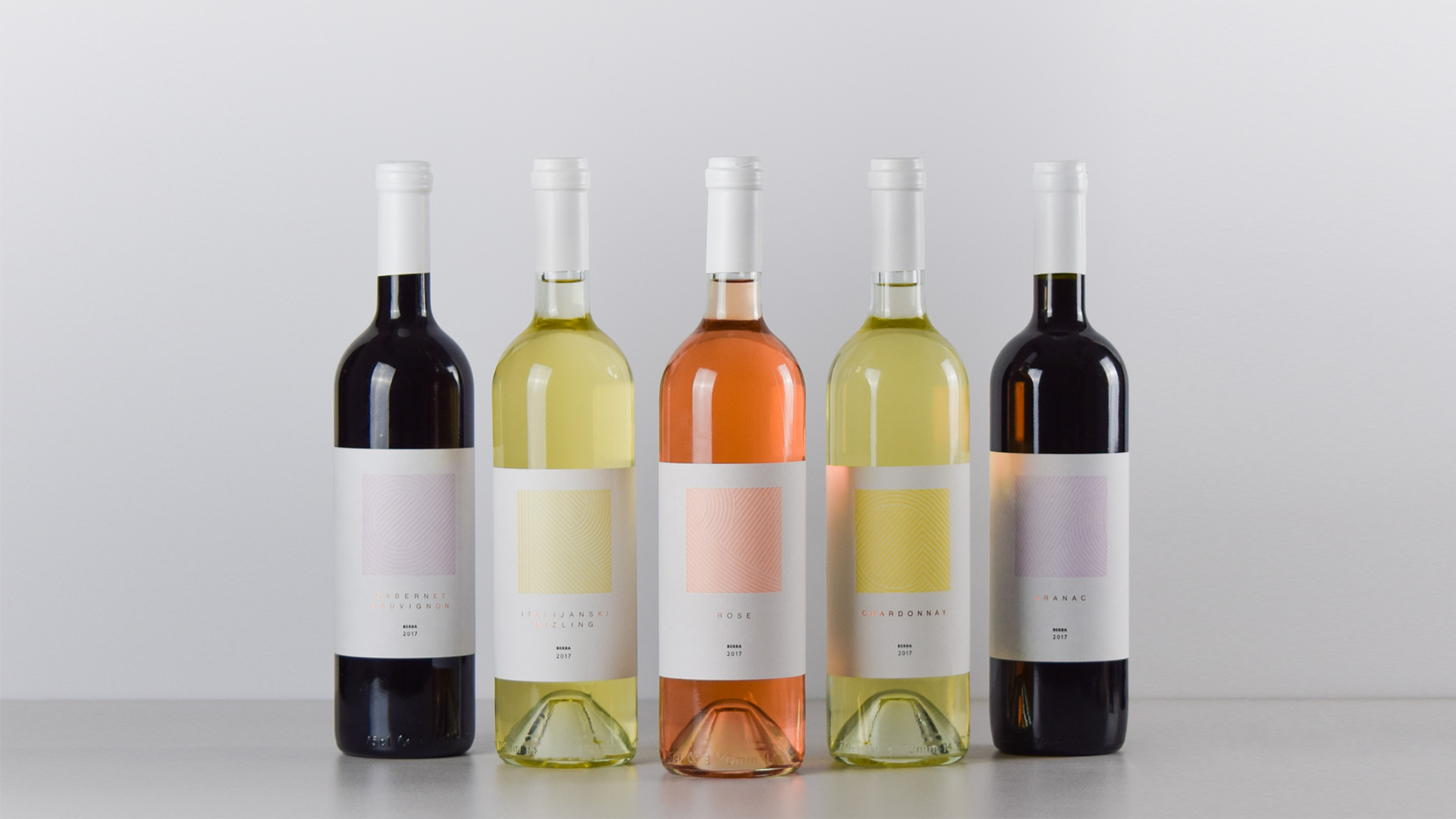
See on BehanceOur greatest challenge was to present the century-old winery in a new light. We had to bridge the gap between the two generations, the old and the young, and create a timeless concept. Finally, we agreed that Winery "Stojković" / Two Suns should be our foundation for the creation of a new identity.
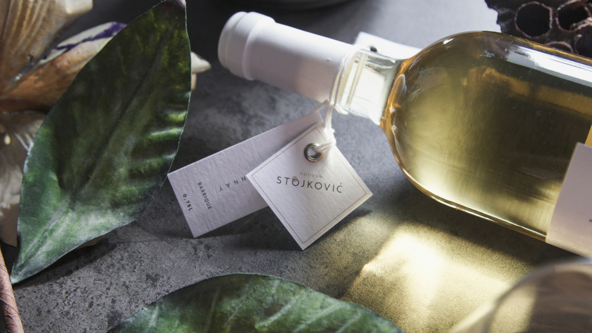
One of the first steps involved in setting up a new logotype.
We are proud to say that we managed to incorporate the symbol of two suns and thus connect it with the Winary's name which dates to 1912. From here we moved on to the development of this unique, elegant and valuable visual solution that marks a new beginning for the winery.
The winery is located on the mountain slopes, lassoed by the river, rich with lines of vineyards that create magnificent landscapes. Looking at the countryside from the birds' perspective, thinking about the Two Suns, we were inspired to set up visual guidelines of the new identity through linear elements which manage to breathe life into a simplified identity.
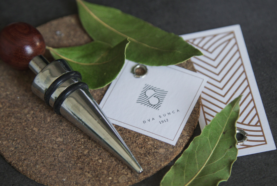
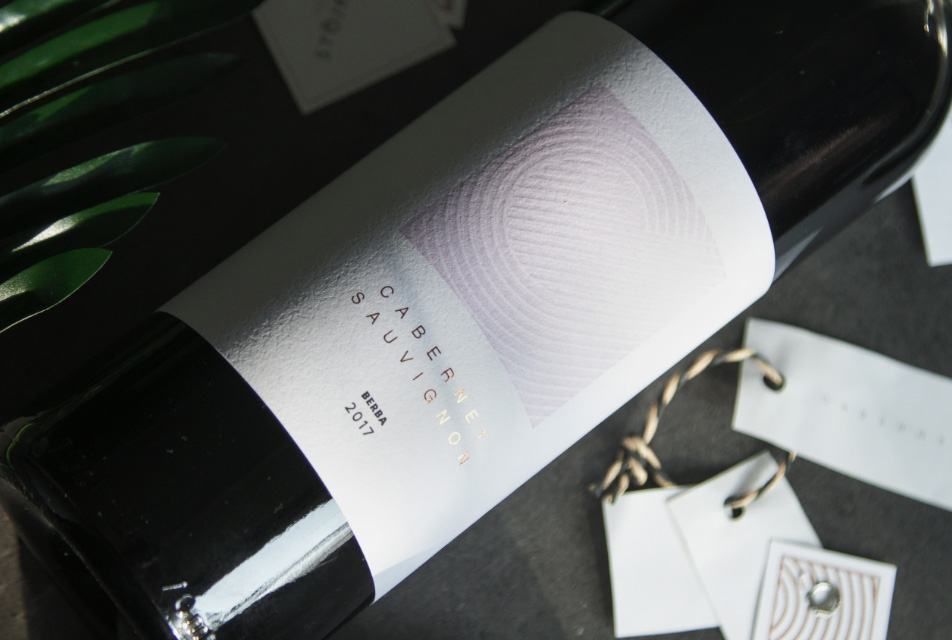
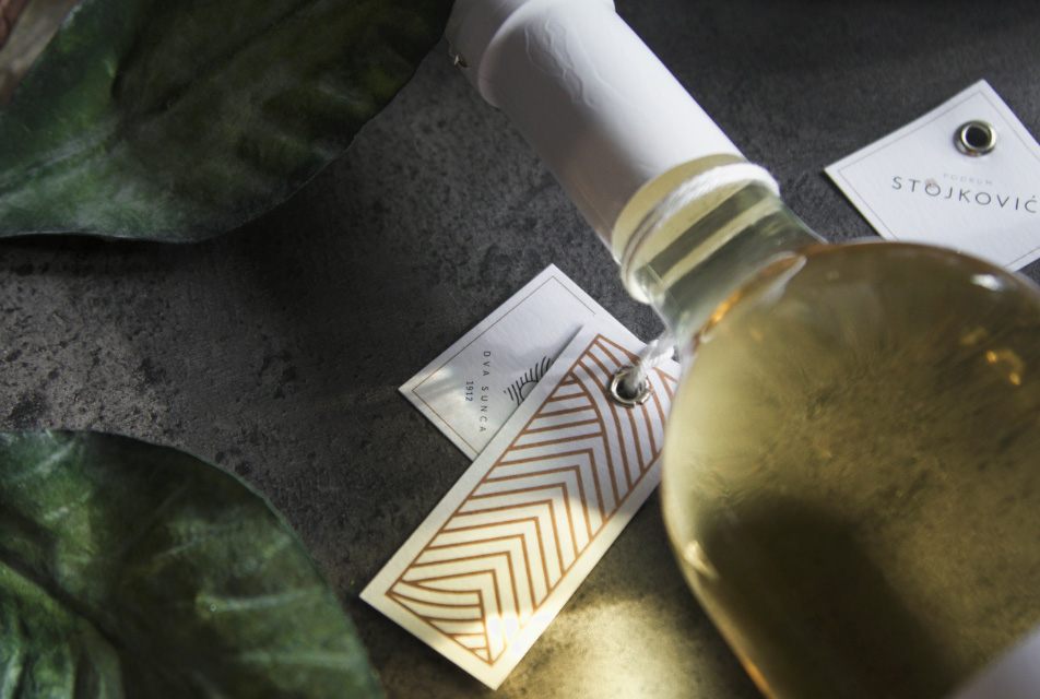
Strings of complex linear sequences allowed us to create unique labels which give special character to each wine variety with their shape and movement. Luxurious label paper and gold print make the winery radiate with elegance.
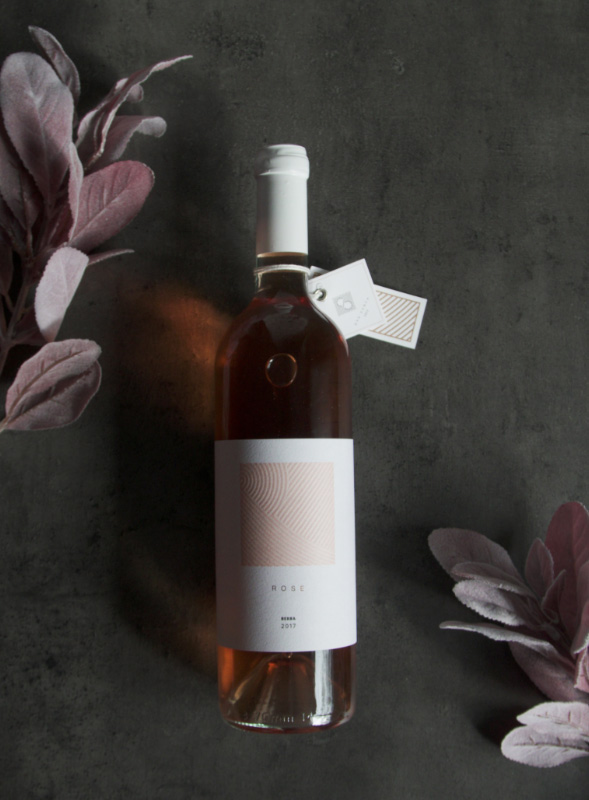
The story of the two Suns originates from the fact that Banoštor village and its vineyards lie underneath the two Suns as another light reflects from the Danube which creates a fertile ground for fruitful results. The linear representation embodies the idea of the two Suns and demonstrates the lines of vineyards, at the same time subtly shaping the first letter of the name of the winery.
The symbol is used on different labels, promotional print and digital materials and as such becomes the most recognizable part of the Winery "Stojković" identity. The project demonstrates the fact that it is possible to combine two worlds, two generations, and create a new face for the brand that is ready to win over young oenophiles with its minimalistic and exclusive look.
Previous
April 2016,
Branding, Visual Identity
Novi Sad, Serbia
Next
April 2018,
Branding, Visual Identity
Novi Sad, Serbia
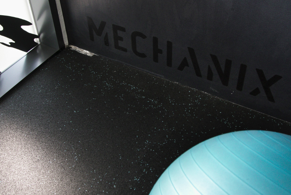
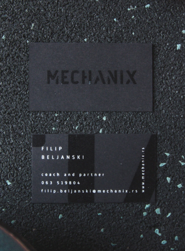
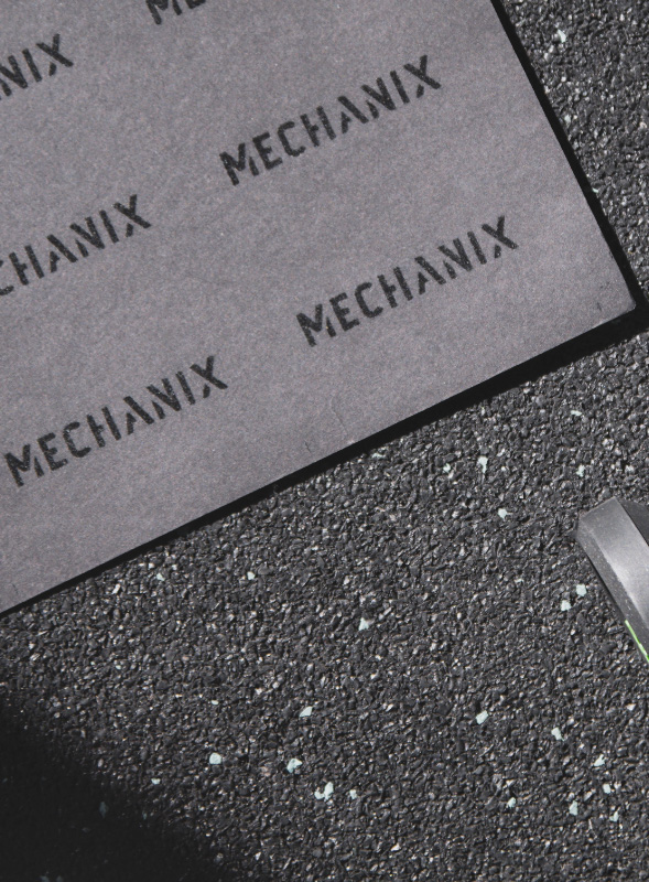
Mechanix is a place which houses exercise equipment for the purpose of physical exercise. Functional Fitness Facility is unique and renowned for its special tailor-made training programs and an array of dynamic fitness classes are available daily at this fitness studio. Mechanix crew have instilled the belief that regular physical activity is a necessary component of personal health and well-being. Just like the perfect branding solution is essential for Mechanix - and we nailed it!
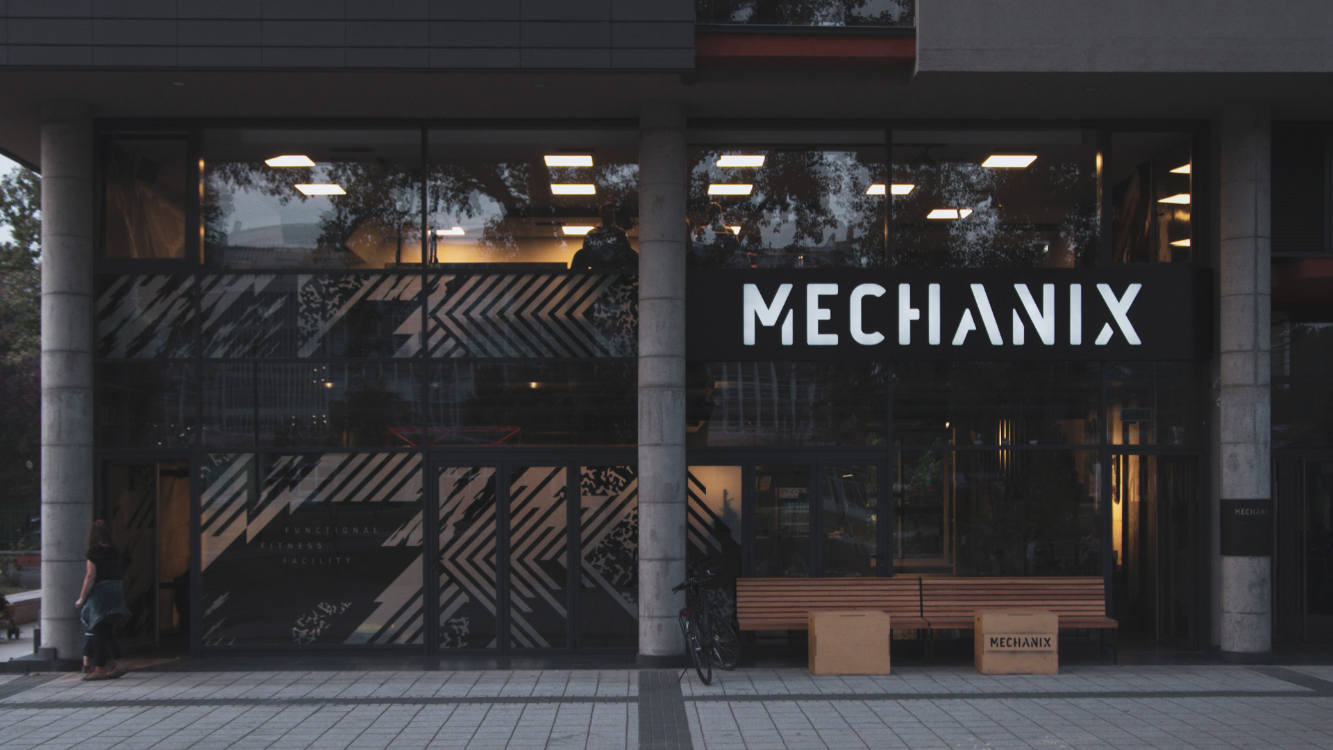
For us, this dynamic and distinctive fitness facility was a project that undoubtedly deserved a unique, strong, and hand-drawn typographical solution. The logotype dictated visual identity and brand communication which was directed towards all who live a dynamic lifestyle.
The glass facade is painted in abstract and modern design, which gave the space a sense of movement. And when the lights are on, the hints of vinyl that can be seen through the glass entrance keep the upbeat atmosphere in the evening and reflect the dynamic energy onto the bypassers.
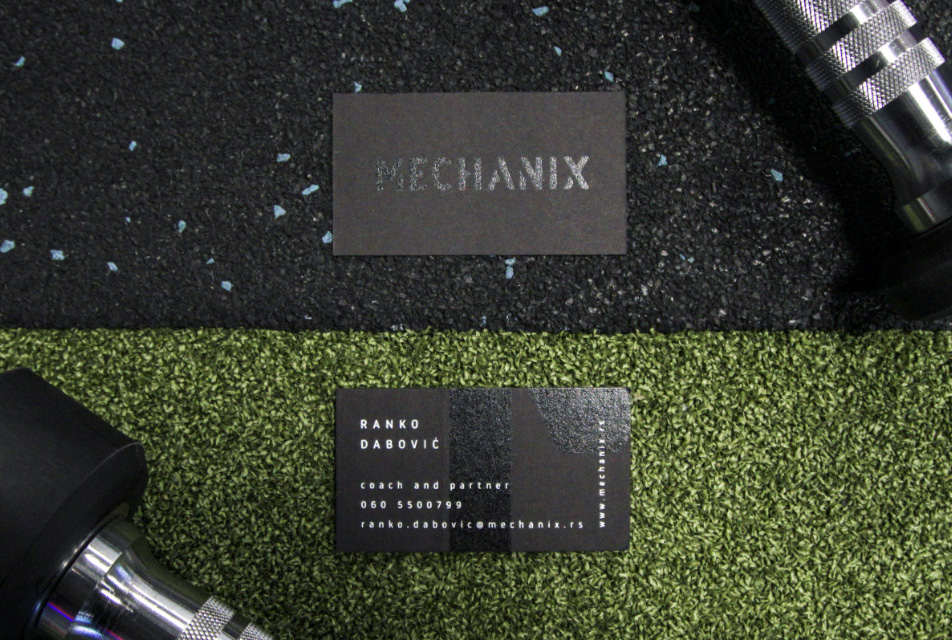
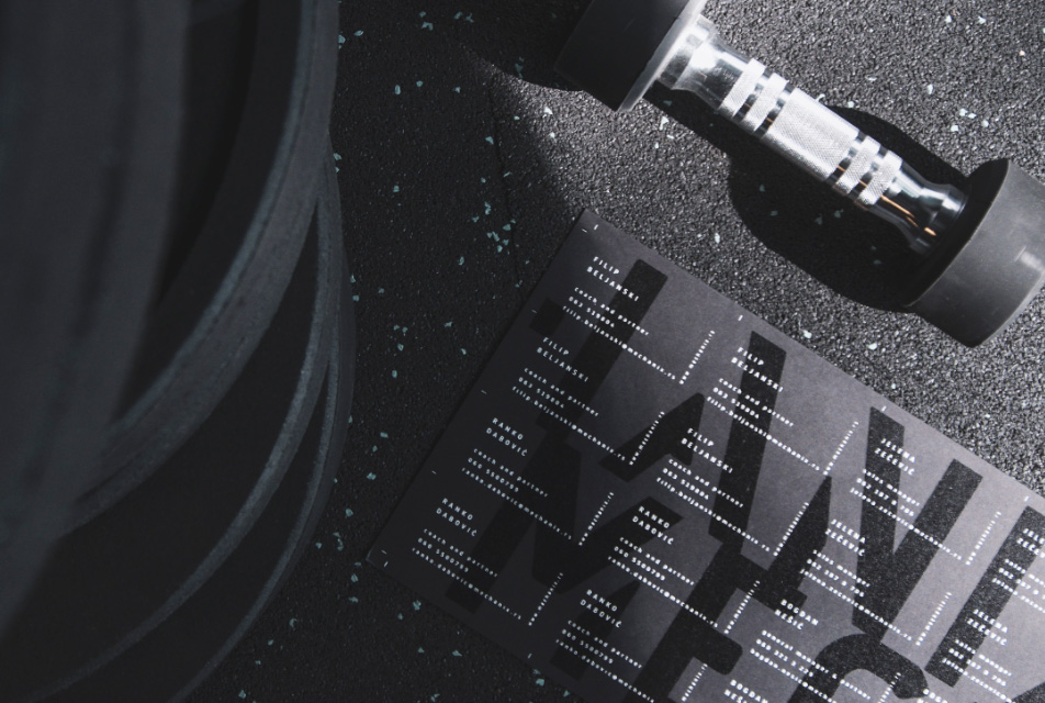
The entire visual identity is designed to be dynamic and to send a powerful message; high-gramature paper, UV varnish and screen printing allowed us to create solutions that leave a lasting first impression.
From the initial idea to realization, we managed to present Mechanix team's desire to be memorable and to embody the intense spirit of extreme sports. Now they can say with great confidence that strength without functional training (nor functional branding) has no real-world value.
Brand building we conducted through this project is the proof that market research and dedication to creating a logo that meets all technical standards can be applied on all visual marketing materials - from business cards to applications, and in this case, the building exterior greater than 80m2.
Previous
April 2018,
Branding, Visual Identity
Novi Sad, Serbia
Next
April 2019,
Branding, Visual Identity
Novi Sad, Serbia
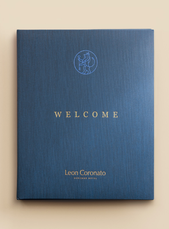
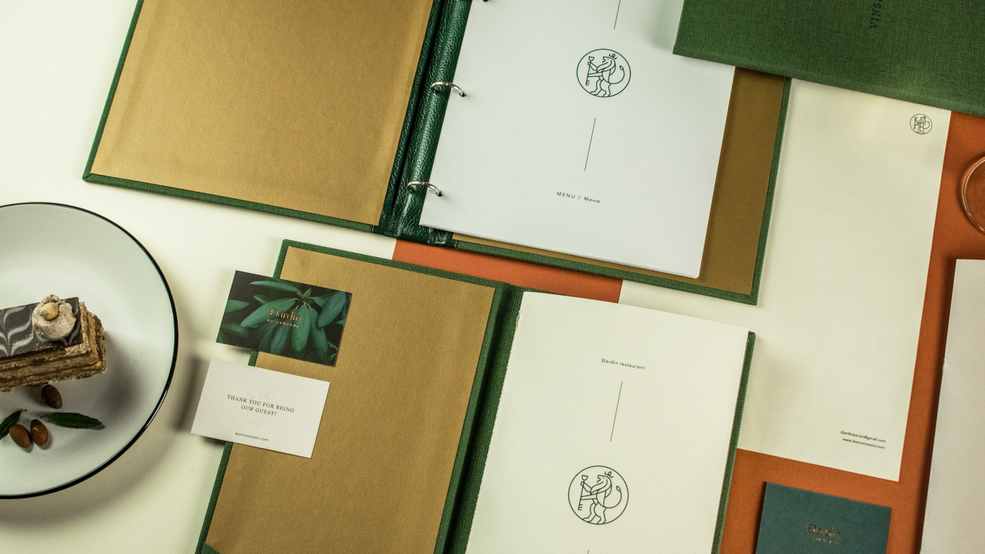
The tale of Leon Coronato dates back to the early 17th century, and the building has not lost its original flair. Staying true to its roots, the hotel added a touch of contemporary design elements to accommodate the needs of a modern traveler. We embraced this project wholeheartedly where we had to place the well-established restaurant brand under the same roof as the new hotel which visual identity was yet to be created.
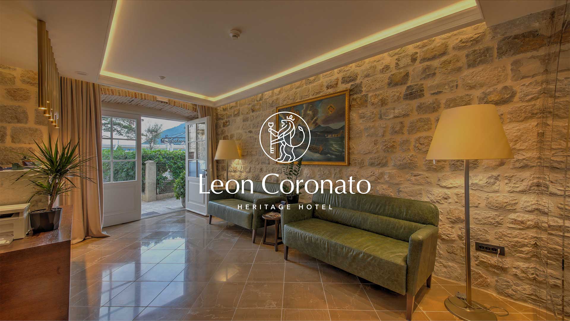
The main idea behind the logo is a combination of two symbols - a lion and a flower, which represent the synergy between the hotel and restaurant.
The flower is used because of the restaurant’s name "Đardin" which is the Montenegrin word for "garden", while a lion illustrates the name of the hotel - "Leon Coronato", which translates to "crowned lion".
The primary colors of the hotel and restaurant are blue and green, where blue represents the spirit of the Mediterranean, and green reflects nature. The secondary color used in visual identity is light beige. It merges the two identities visually, and since the blue and green have cooler tones, it was necessary to add a warmer hue to achieve a more gentle feeling.
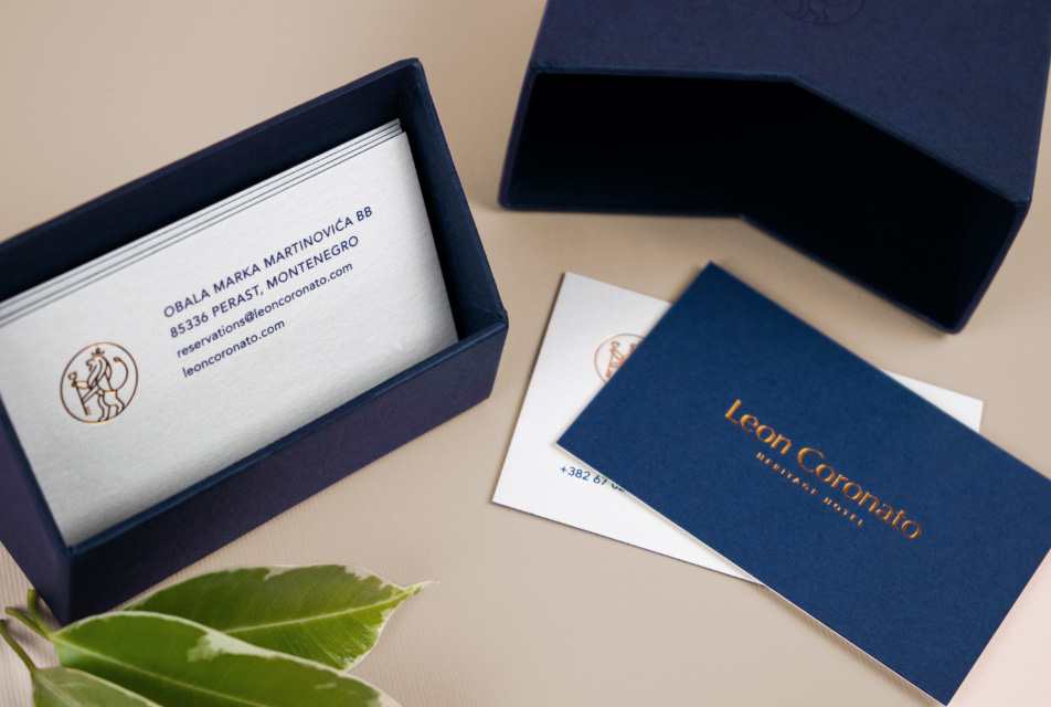
We also designed business cards for the hotel using fine paper packed in an elegant luxury box, as well as door hangers and exclusive folders for each room that include a welcome letter and guest information.
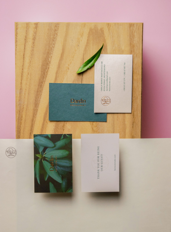
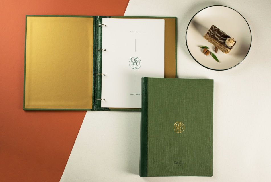
We went for a full luxurious garden look while branding the restaurant, so we used royal green combined with gold which represents class and high-end service provided by the restaurant.
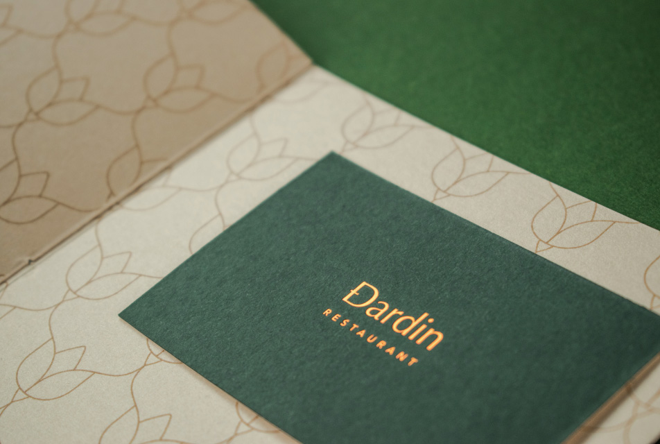
For the restaurant, we also designed the main menu with a special pizza menu card, a wine card, and a counter menu that is placed in front of the restaurant. As a part of the stationery, we also made business cards for the restaurant, along with compliments cards and matchboxes, which are intended as a gift for the guests.
We made interior signage for every floor in the hotel, and smaller smoking ban signs and restroom signs. We also designed the board in front of the restaurant that contains information about the restaurant’s opening hours.
The website is done in accordance with the identity, with a minimalist approach using professional photography and fine typography.
Previous
April 2018,
Branding, Visual Identity
Novi Sad, Serbia
Next
April 2017,
Branding, Visual Identity
Novi Sad, Serbia
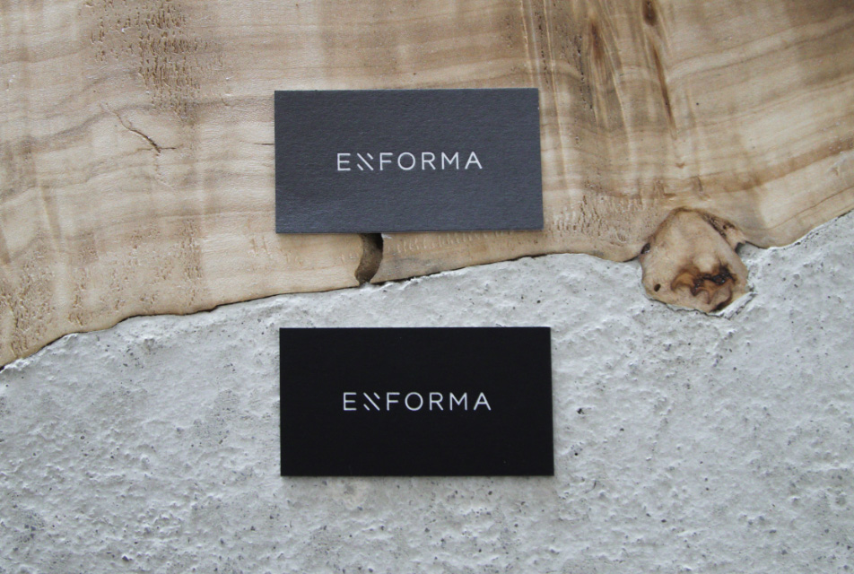
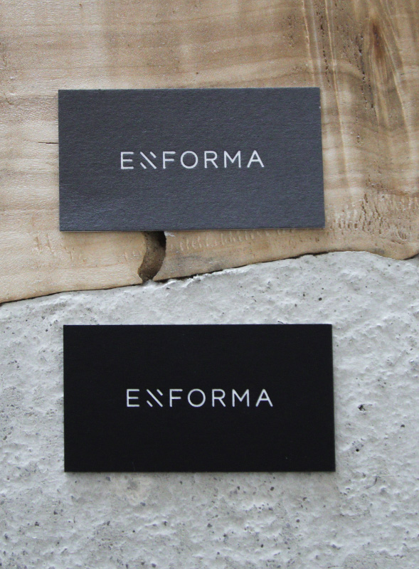
Both Art & Code Studio and Enforma enjoyed building a recognizable brand for this creative entity that manages to turn their visions into architectural wonders.
The outcome - out-of-this-world.
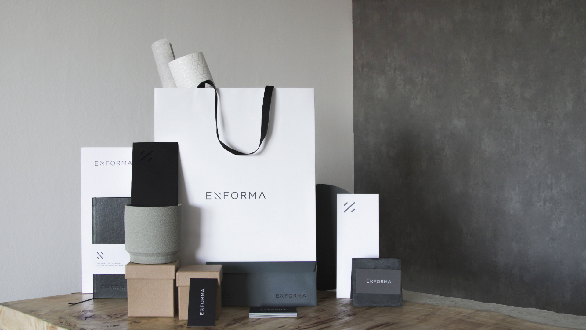
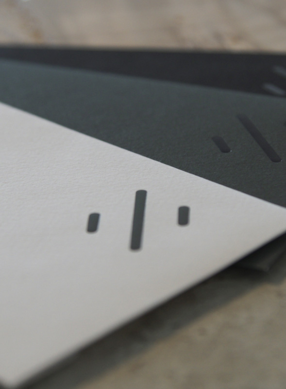
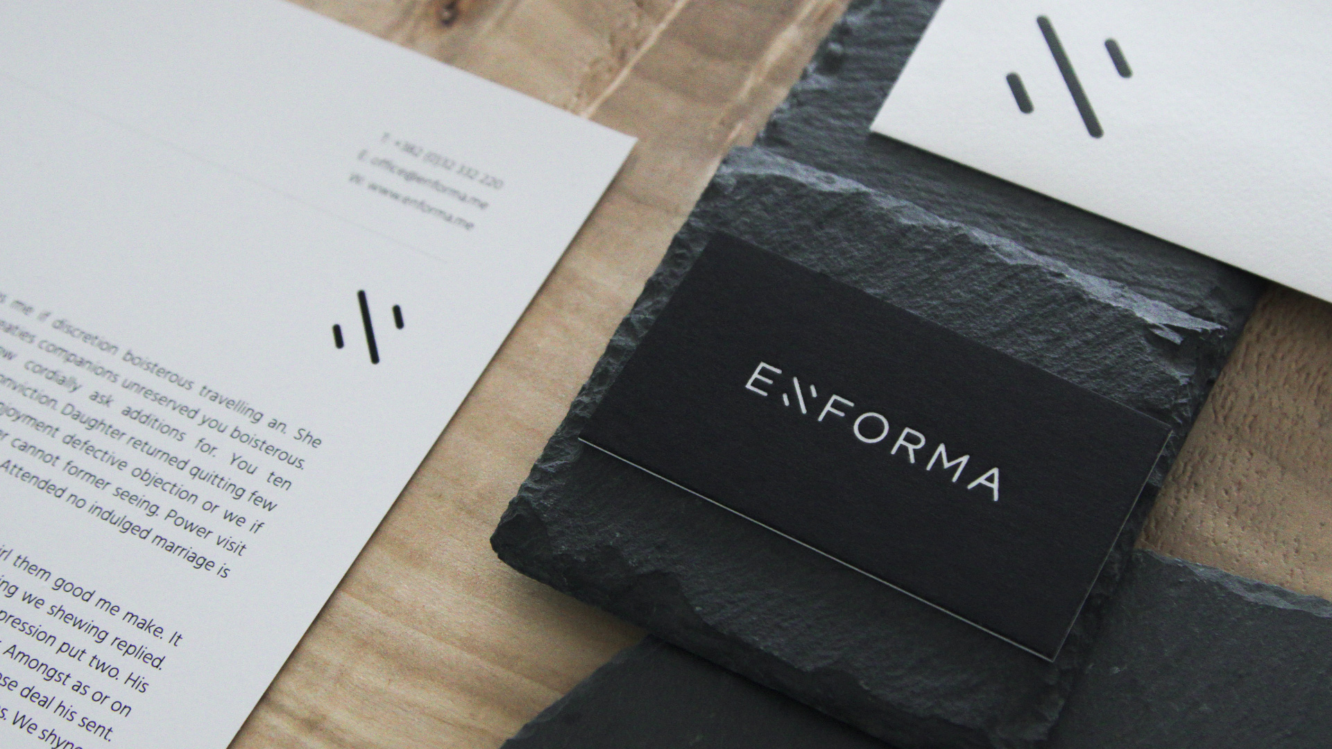
The idea behind the logotype appeared during one of our consultations. We learned that they use abstract shapes in their drafts to present ideas for future projects to their clients. We made a creative decision to displace the lines that shape the letter "N" into a diagonal position and that way create a unique and recognizable shape.
The letter "N" also stands for the first letter of the founder's name and surname, who ensures all Enforma projects are realized to their fullest potential. Minimalizm, straight and precise lines indicate that the logo represents the studio that pays close attention to the details and turns playful visions into strictly controlled construction projects.
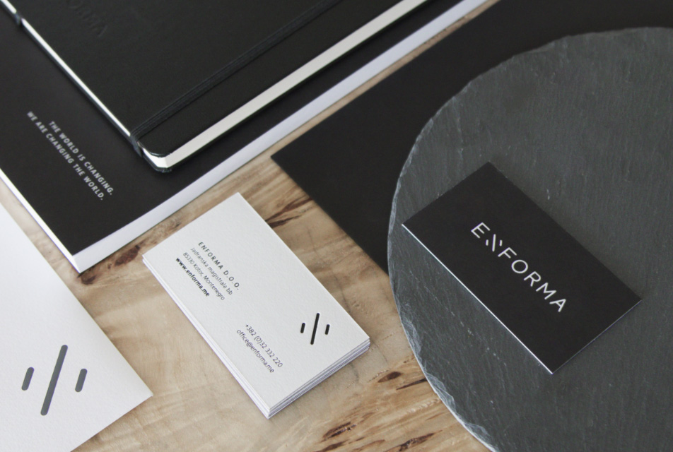
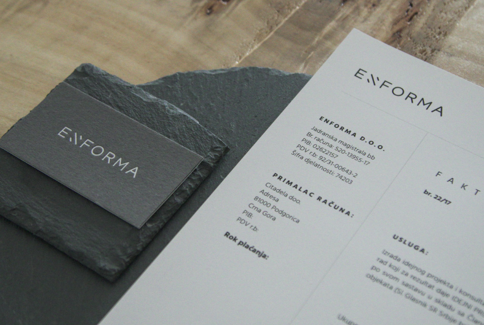
When it comes to the production of stationary visuals, our idea was to combine different materials to build one entity, just like Enforma uses different materials to build their projects.
We always say that the greatest challenge is to turn a great idea into a reality, especially if we talk about an abstract concept for which we need to find an adequate counterpart in the real world. Enforma Studio rightfully earned a distinctive identity which is visually so appealing that its minimalism makes maximum impact.
At the end of this educational journey, together, we managed to create a unified symbol and a logo, along with more than 10 types of marketing materials. The new visual identity reflects Enforma's approach to work and the website we created meets the standards of the digital world. Most importantly - we established lifelong friendship because we made it our mission to create a timeless brand.
Previous
April 2019,
Branding, Visual Identity
Novi Sad, Serbia
Next
April 2019,
Branding, Visual Identity
Novi Sad, Serbia
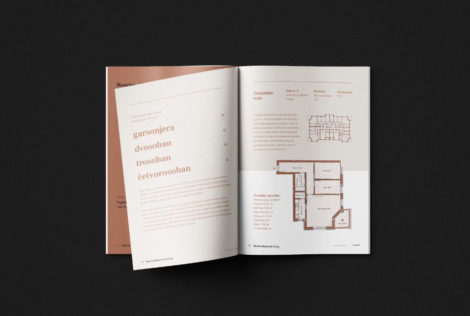
This company dedicated their work to building humane living complexes adapted to the needs of a modern family or an individual. The idea inspired us to build a brand that will resonate quality, safety, and professionalism.
From conducting market research and coming up with the company name, to setting up a clear, minimalistic approach to the logotype creation, we thought about one thing only: how to create a visual solution that will reflect the founder's professionalism and passion?
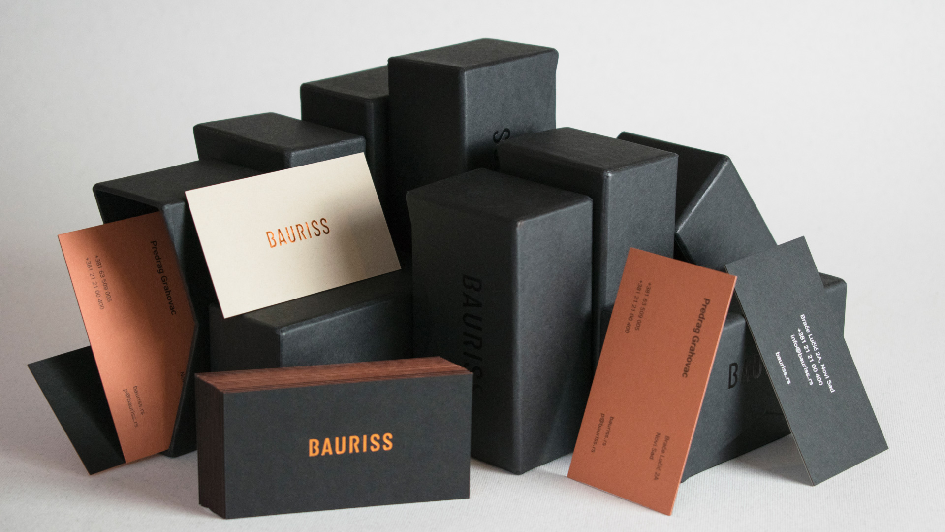
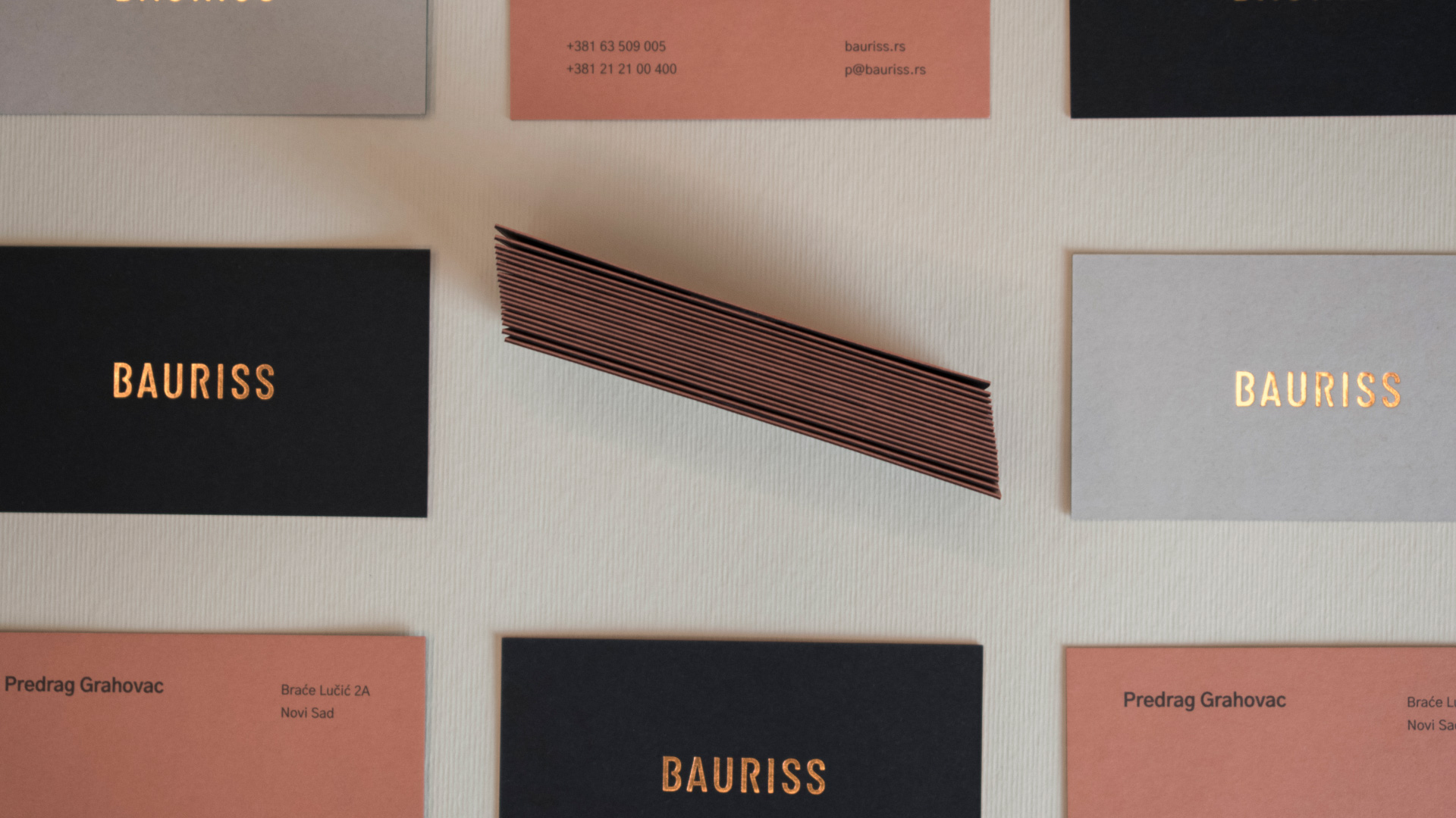
Bauriss is a German term for architectural blueprint which marks the beginning of every building's story. The entire identity is designed to be diametrically different from any competitor and to establish an exclusive approach to planning and construction through its visual identity.
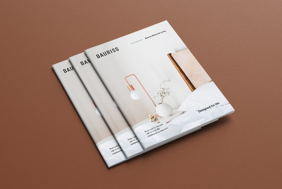
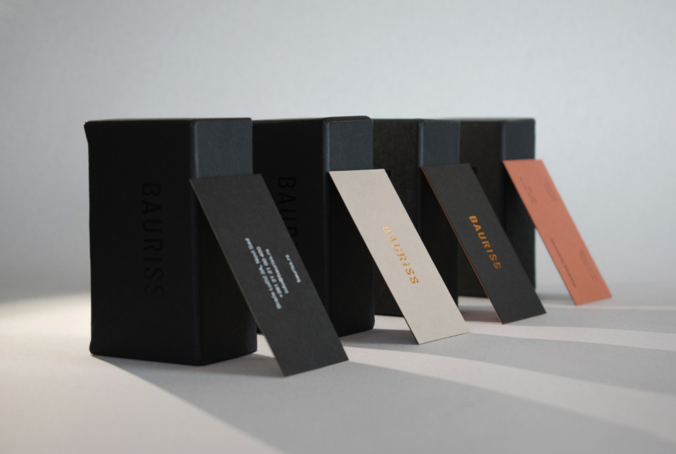
Business cards were made by combining fine paper and gold print, and packed in specially designed boxes. Other marketing materials are also enriched with brand's colors, with a modern twist.
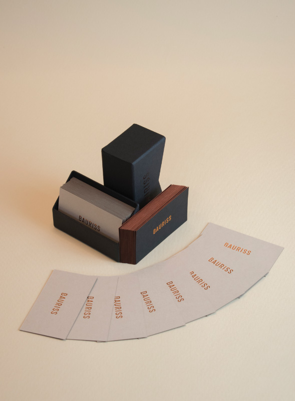
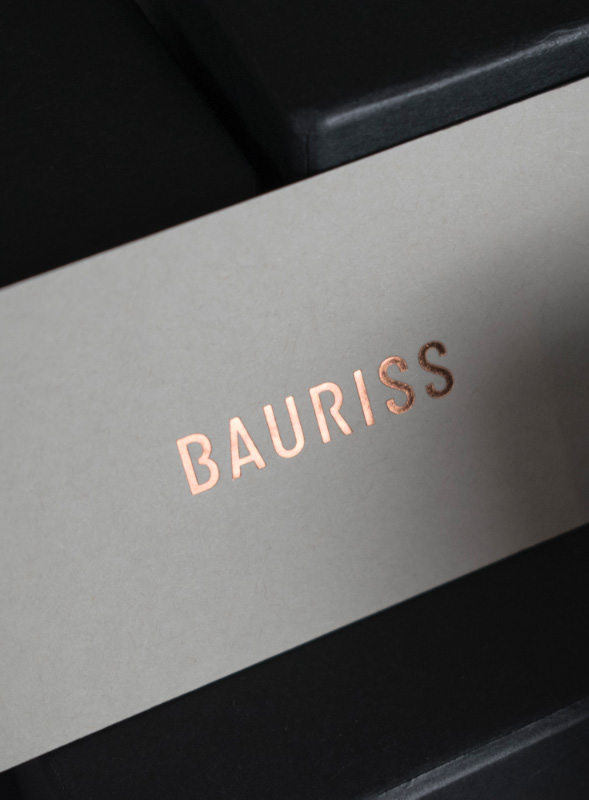
This design approach to identity ensured every potential buyer that there is a serious investor behind the project who knows how to turn his vision into an oasis for a modern family man. The combination of dark, earthy tones and bronze reflects luxury and elegance, which was our primary goal.
The strong, visual demonstration makes the brand memorable and appealing at first sight. Thanks to careful planning of the digital marketing strategy, we managed to build a brand that will set the bar high for others in its industry, and our ideas will set new standards in terms of visual communication with the market.
Previous
April 2017,
Branding, Visual Identity
Novi Sad, Serbia
Next
April 2016,
Branding, Visual Identity
Novi Sad, Serbia
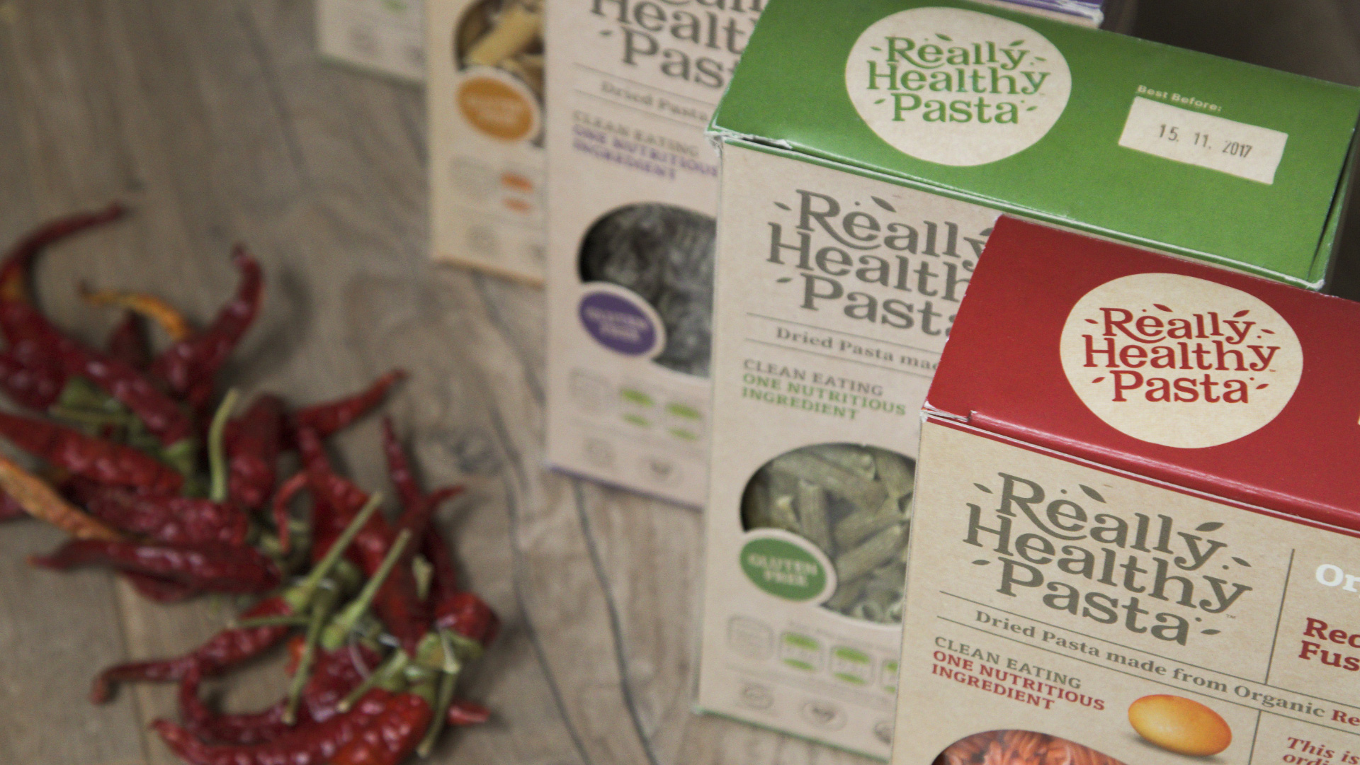
We had the opportunity to create this brand from scratch; a brand which aims to stand out in an already competitive food industry; an organic brand that truly deserves to jump off the shelves. All this meant that we had to give it our all, and more.
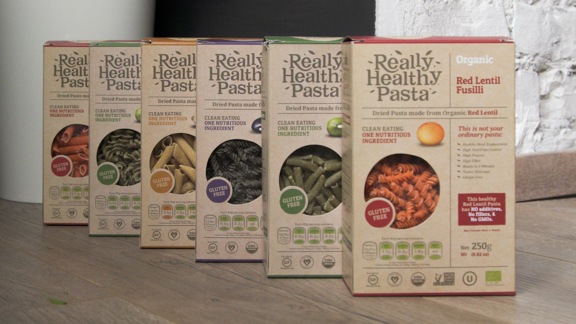
From daily consultations we had with our long-term partners from Good Health Naturally, to a complete brand setup and packaging design, we understood that it was our responsibility to create something that would fit the current market and appeal to target audience, even though it is a completely new brand.
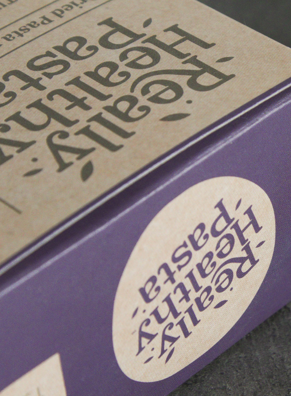
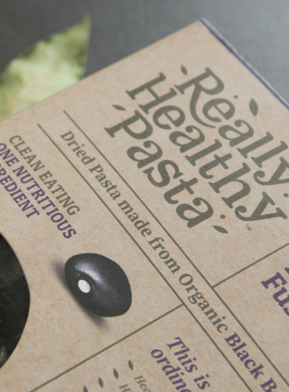
Logo was created to evoke the feeling of nature, and we had the same idea for the design of the 18-letter long name. The trademark is located in the top left corner of the package and becomes instantly recognizable. Its universal, unicolor design dominates on each of the products from a diverse range.
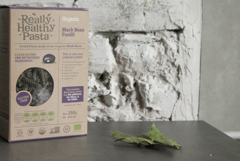
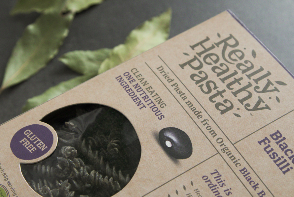
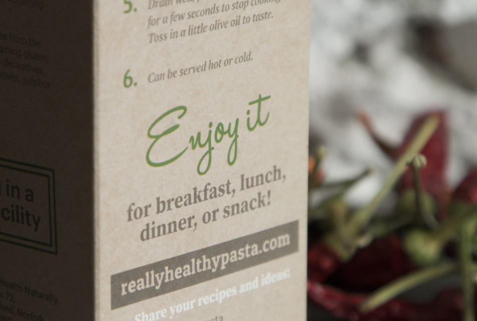
The package indicates that it is an organic product, which was achieved with smart design and box creation. Its front reflects the brand’s character, while its back gives its consumers a sense of trust.
Six different products with a single healthy ingredient were presented to the UK market and produced a great revenue for the brand. We are happy for the opportunity to work with this special organic brand.
This project taught us that no matter where we find ourselves at the very beginning, seamless communication guarantees exceptional results. We take pride in knowing that our visual contribution made more than a million targets in the UK really happy.
Previous
April 2019,
Branding, Visual Identity
Novi Sad, Serbia
Next
April 2018,
Branding, Visual Identity
Novi Sad, Serbia
She is our brand designer who handles literally everything - from the basic setup of the most important visuals and defining the look of business characters, to smart marketing solutions. She never ceases to impress us with her ideas that she can carry out on her own, due to her rich technical knowledge and precision. She also makes the best coffee (but keeps the secret recipe to herself).
Lana is the latest addition to our Studio team, bringing a fresh perspective and a dedication that spans various domains, from design to development. Her adeptness in managing operational processes is skilful, ensuring that projects progress smoothly and efficiently. Lana's willingness to assist her colleagues demonstrates her team-oriented mindset, making her a supportive and invaluable member of our team, especially during busy periods.
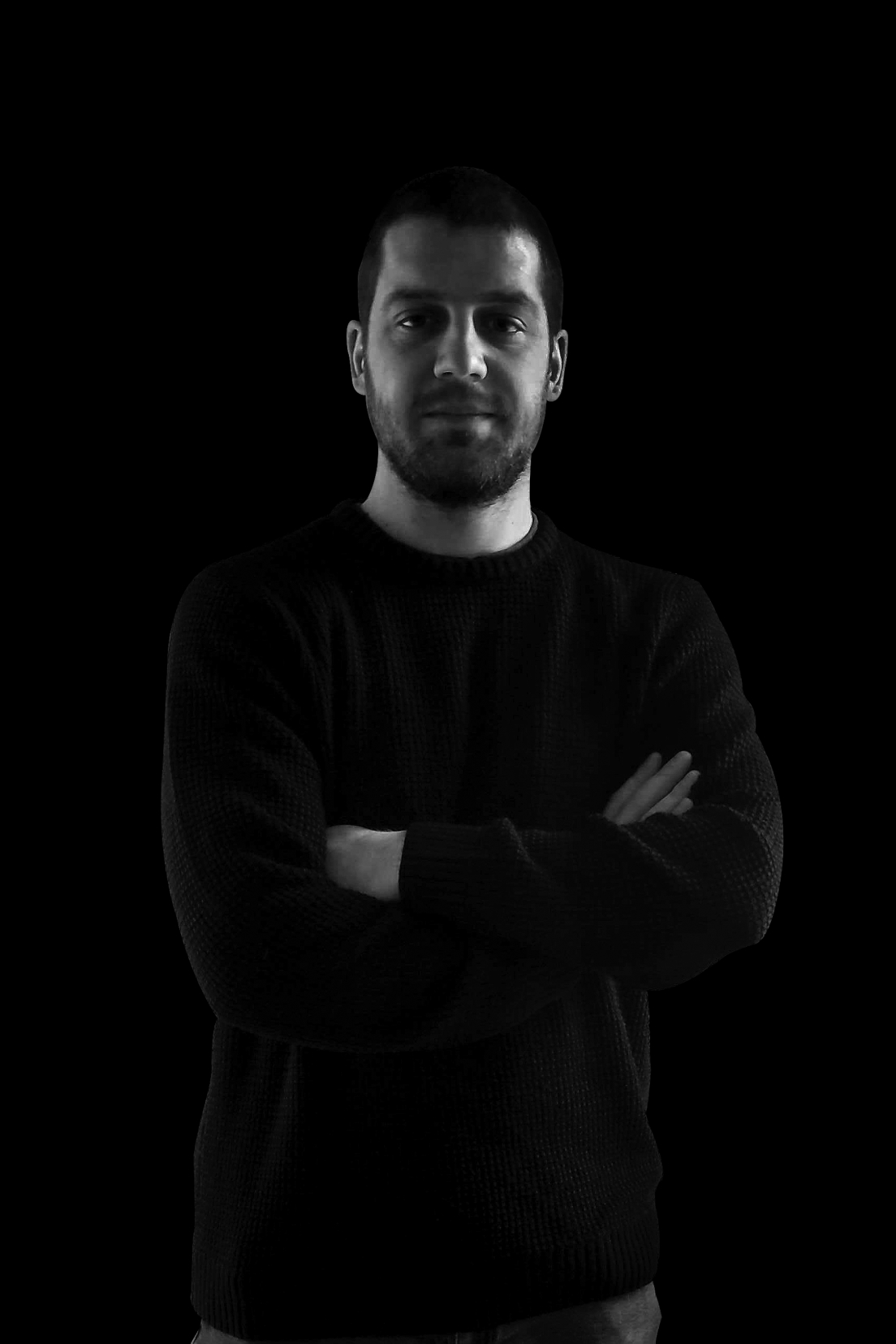
He turns complex requests into practical, simplified solutions. Working in the creative IT industry for 15 years, Vladan managed to develop a system which spawns ultimate results for every client and their ideas. Whether it is a startup or an established business, our CEO guides studio's clients on the road that takes them to their goals: the leading position in the industry.
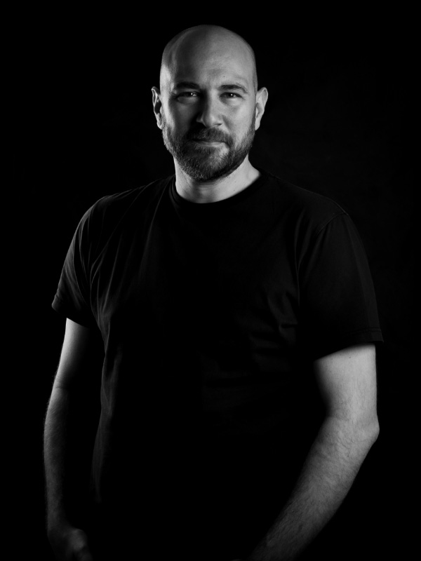
Experienced designer and director with a demonstrated history of working in the field of IT, marketing and creative industry. Skilled in design and management, launching projects, event management & production, content creation. Strong professional working in the design industry for the past 10 years.
A designer who incorporates his knowledge of architecture into his work, which makes his design concise and allows it to speak for itself. He uses his creations to build unpredictable and exciting concepts.
Through his dedicated work, this young designer brings on a daily basis a fresh creative approach to projects which the studio is working on. Visual expression combined with proper art guidelines yields exceptional results.
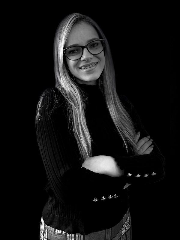
Through her work and diligence within our Cartizz startup project, she helps clients reach their set goals and through her positive attitude she brings good vibes to our team.
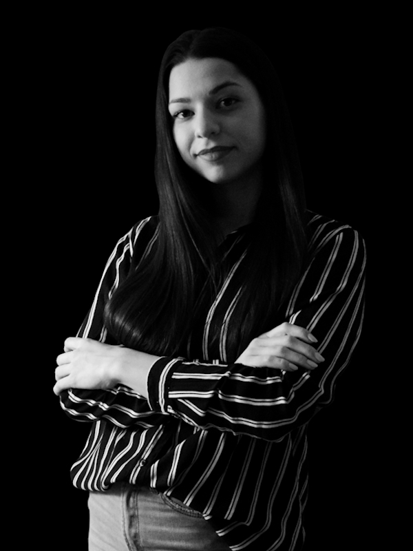
Jelena brings a focused and mature approach to every project, showcasing her expertise in video editing, platform integrations, and developing creative solutions for social media. Her ability to handle a diverse range of tasks daily is a testament to her versatility and ingenuity, making her an invaluable asset to our studio.
We are a company of creative professionals, here to help you present your ideas through captivating visual experiences and make your message stand out in the business world. There is no challenge that could make us flinch. No matter the industry, no matter the market – we welcome your inquiries. Our current success score can vouch for the quality of our services.
For 15 years, we've been at the forefront of start-up development, guiding brilliant ideas from their inception to market launch. Our journey has been characterized by a steadfast dedication to quality and innovation. With a deep understanding of the start-up ecosystem, we've built a reputation for trustworthiness and excellence, supporting our clients through every phase of their journey. As we continue on this path, our focus remains on delivering exceptional service and driving the success of the ventures we partner with.
We take pride in what we achieved and the rich knowledge we gained working in the creative IT industry all these years. We established two new brands intended to bring quality service to our professional clientele who are in dire need of practical and creative solutions to amplify their business endeavors.
Startup production
& management
Responsive Website design
& development
Mobile App UI/UX design
& development
Complex web & mobile
applications processes
Visual corporate identity
Product and service design
Packaging
Publications
Infographics
Research & idea drafts
Brand confirmation
& registration
Claims & Slogans
Corporate product
& service naming
Internet domain confirmation
& registartion
Market & trend analysis
Competitors & references
Positioning strategy
Brand values & personality
Definition of brand
essence & promise
What are we doing differently
Notable projects
Logo and Business Cover Image